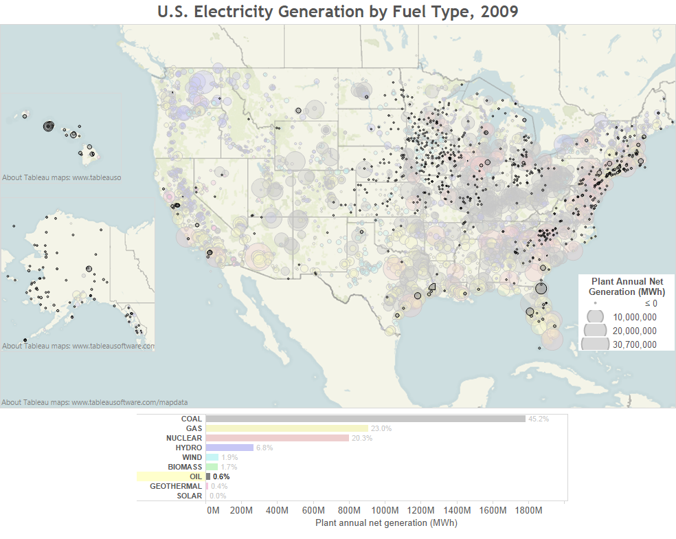
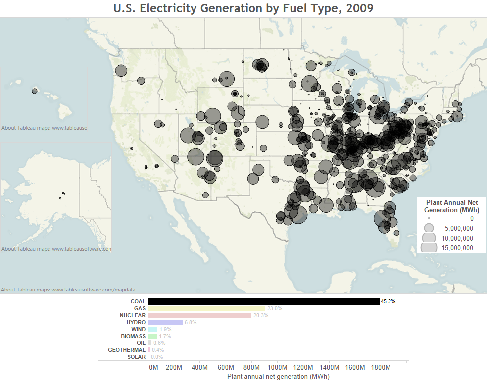
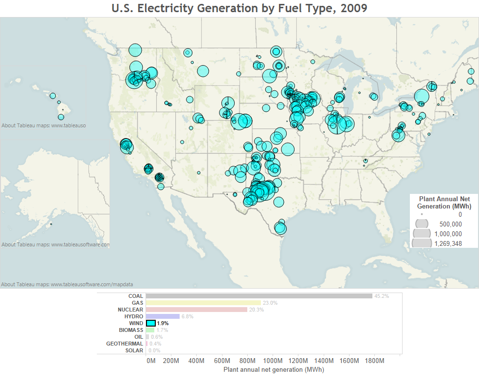
Here is my attempt to show how power is generated in the United States. The data comes from the EPA’s eGRID data set, with 2009 being the most recent data. It is a geographic bubble chart with the amount of energy produced at each plant represented by its size, and the fuel source for that energy by the bubble’s color. I’ve used some transparency to help with the overplotting. Even so, many points close together are hard to distinguish. I added a dark border to each bubble to help with that.
I’ve been using the data visualization software package called Tableau for a while now. It is really a fantastic product, with lots of online tutorials and help. It even has a free one-year student edition!
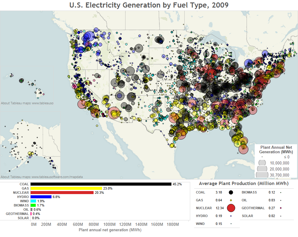
I’ve also used a horizontal bar chart as a legend, and it includes the percent that came from each source. So you can see that we get the largest percentage of our fuel from coal, at 45.2%, and the least from solar, with less than 0.0% (the actual value is 0.03%). The box on the lower right is the average annual plant production for each type of fuel. Note that this is different than the average plant size (its ‘nameplate capacity’). Production refers to how much energy was actually produced during the year, capacity refers to how much power could be provided at any particular time. If all plants operated all the time (24/7) the distinction wouldn’t matter, but all plants have some downtime, like for maintenance, or when the wind doesn’t blow for wind power.
Have any comments, ways it could be improved, or would you like to see a subset of the map, say with just a single component highlighted, just let me know!
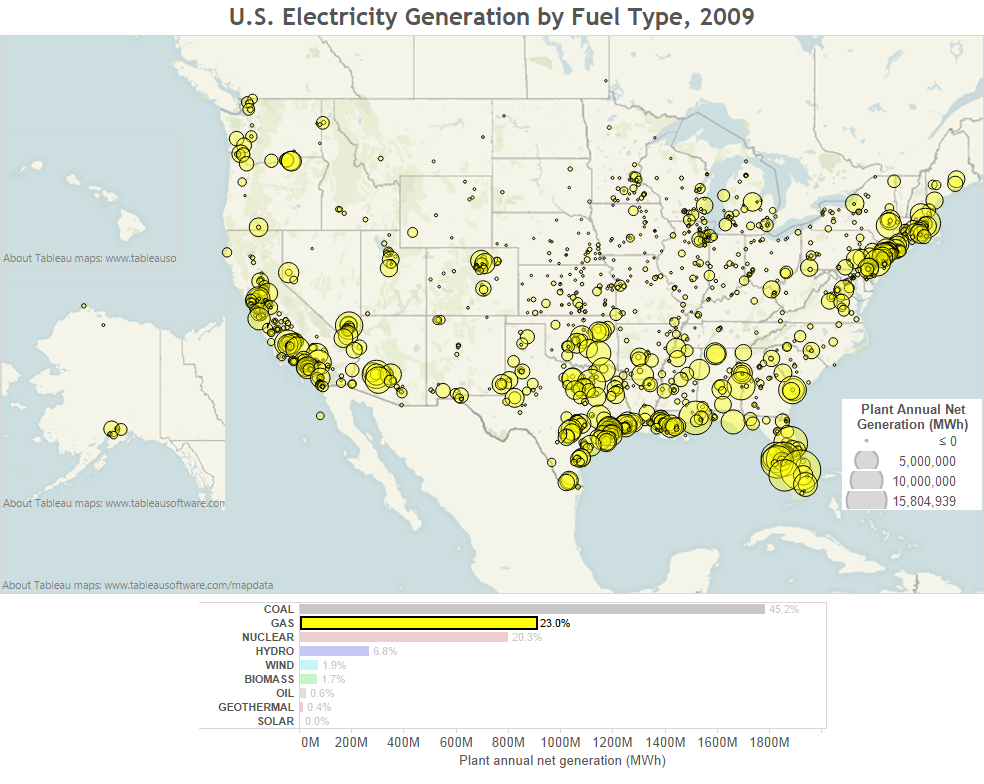
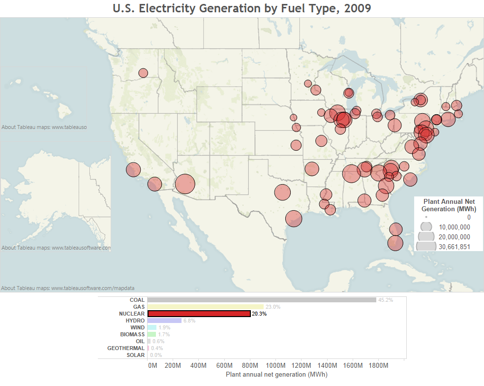
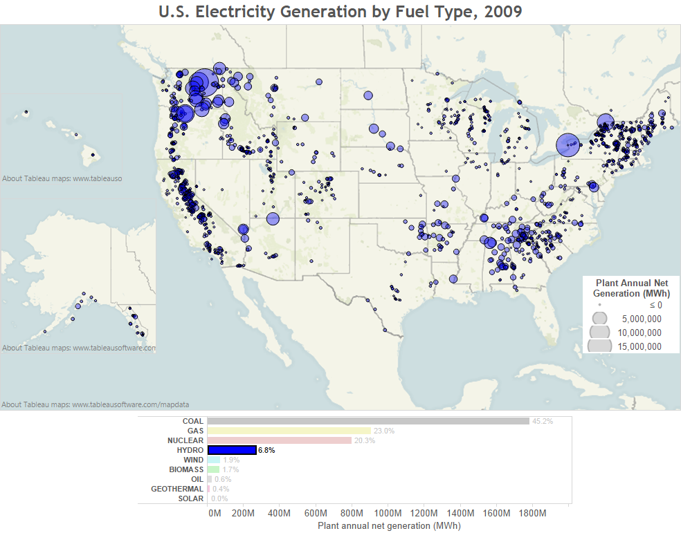
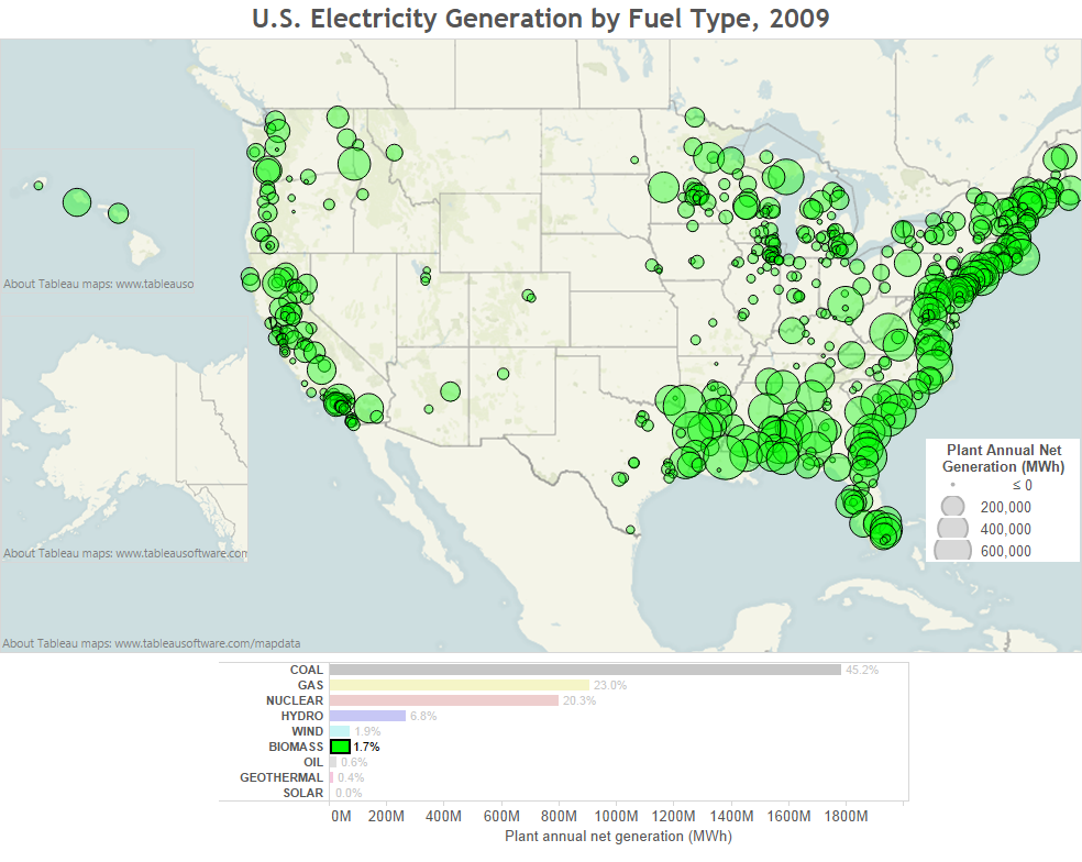
Update: Because I couldn’t help myself, I went ahead and made the individual plots as well:
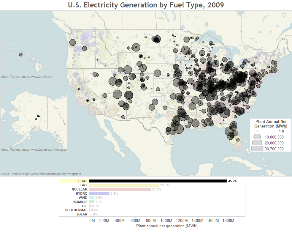
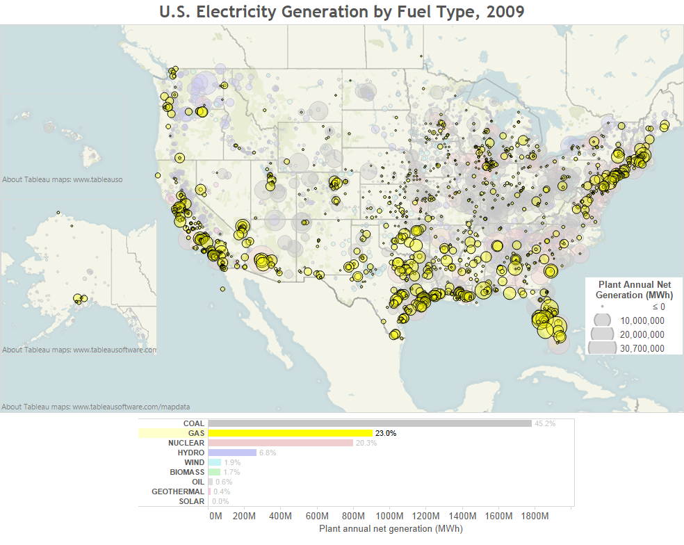
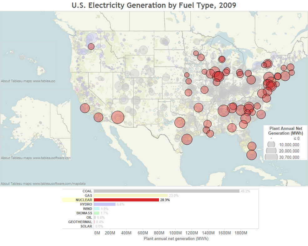
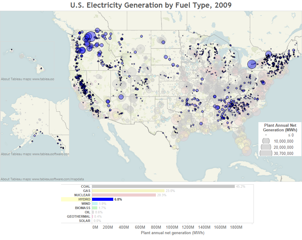

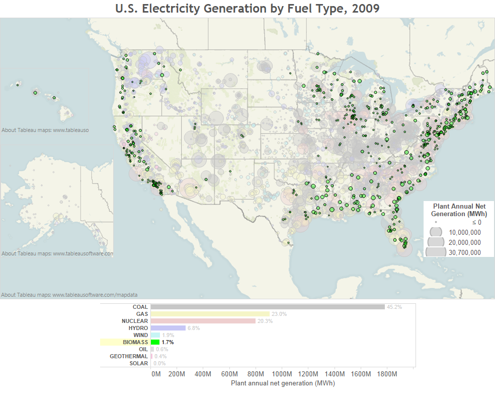
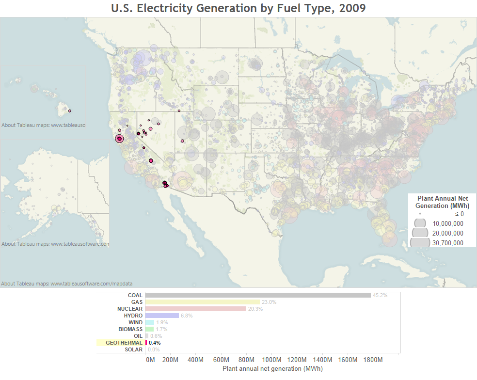
The images below are rescaled to show each type of fuel individually and the other washed out power plants were removed. Be careful comparing them to the first map (with all fuels shown together) as the bubbles are very different scales.
Visualization of Energy Production in the United States using the EPA’s eGRID Dataset by Steven C. Isley is licensed under a Creative Commons Attribution 4.0 International License.
