I recently got interested in the work of James Hansen. Some of his work appeared in the New York Times in 2017 as an interesting visualization of climate change. I decided it would be fun to recreate the chart using publicly accessible data.
Overview
To start with, I had to learn about publicly available climate data. The best source I found is actually data from Berkeley Earth. This is the group originally funded in part by the Koch brothers. Climate skeptics had hoped their results would show the scientific consensus was wrong but it ended up confirming everything the scientific community had been saying. Plus, the world got a fantastic set of cleaned data made freely available. At the Berkeley Earth link above, choose the “Breakpoint Adjusted Monthly Station data” as it’s the most relevant for this analysis.
The code below imports the data and provides some nicer column names.
f <- function(number, digits=0) formatC(as.numeric(number), digits=digits, format="f", big.mark = ",")

d <- read.delim(file="./LATEST - Breakpoint Corrected/data.txt",
                comment.char = "%",
                strip.white = T,
                sep = "\t",
                col.names = c("StationID", "SeriesNumber", "Date", "Temp",
                              "Uncertainty", "Observations", "TimeofObservation"))

sites <- read.delim(file="./LATEST - Breakpoint Corrected/site_detail.txt",
                   comment.char = "%",
                   strip.white = T,
                   sep = "\t",
                   col.names = c("StationID", "StationName", "Latitude", "Longitude",
                                 "Elevation", "Lat.U", "Long.U", "Elev.U",
                                 "Country", "StateProvinceCode", "County", "TimeZone",
                                 "WMOID","CoopID","WBANID","ICAOID","NumRelocations",
                                 "SuggestedRelocations", "NumSources", "Hash"))
The next chunk of code does all the heavy lifting. I love the dplyr package by Hadley Wickham. It’s part of the larger Tidyverse universe, and I highly recommend it for any aspiring R coders out there. It makes this job way easier than it has any right to be!
The code below is commented, but in general, it does the following:
- Extract the year and month from the date. Berkeley Earth uses a strange date format that corresponds to fraction of a year.
- Create a variable to hold the time period. For the NYT article, the baseline period was 1950-1980. After that, I just go by decade.
- Using just the summer months of June, July, and August, calculate the average temperature.
- For each station, calculate the mean and standard deviation temperature for the baseline period.
- For each station and year, calculate the “Local Standard Temperature Anomaly” (LSTA) which is just the average summer temperature, minus the baseline average, all divided by the baseline standard deviation.
- Bucket the results from “Extremely Cold” to “Extremely Hot”. Dr. Hansen uses a somewhat strange definition. He uses -0.43 to +0.43 LSTA as “Normal”. Then “Cold” and “Hot” are out to -3 and +3 LSTA respectively, and “Extremely Cold” and “Extremely Hot” are beyond those limits. He did this to make 1/3 of standardized temperatures in the base period be “Normal”, and 1/3 hot and 1/3 cold.
T.bucket.names <- c("Extremely Cold", "Cold", "Normal", "Hot", "Extremely Hot")

all.std <- d %>%
  # Extract the month and year from the date format
  mutate(month = f(Date %% 1, 3),
         year = floor(Date)) %>%
  # Keep only the summer months
  filter(month %in% c("0.458", "0.542", "0.625")) %>%
  # Calculate the mean temperature for each station and each year
  group_by(StationID, year) %>%
  summarize(Temp = mean(Temp)) %>%
  # Create a variable holding the decade
  mutate(period = cut(as.integer(year),
                      breaks = c(-1, 1950, 1980, seq(1990, 2020, 10))),
         period = str_sub(period, 2, -2)) %>%
  separate(period, into = c("start", "end"), sep = ",") %>%
  mutate(period = paste0(as.integer(start) + 1, "-", as.integer(end))) %>%
  # Add a flag for the temperature reading being in the "baseline" time period
  mutate(in.baseline = period == "1951-1980") %>%
  # Filter out any station that doesn't have more than 25 years in the baseline and
  # at least 8 different periods
  add_count(StationID, period) %>%
  group_by(StationID) %>%
  mutate(baseline.years = sum(in.baseline)) %>%
  filter(baseline.years >= 25 & n >=8) %>%
  # For each Station, add the mean and standard deviation of the baseline period temperature
  group_by(StationID) %>%
  mutate(std.baseline = sd(Temp[in.baseline]),
         mean.baseline = mean(Temp[in.baseline])) %>%
  # Now calculate the local standardized temperature anomaly
  # and put each temperature reading into a bucket
  mutate(T.std = (Temp - mean.baseline)/std.baseline,
         T.std.bucket = case_when(
           T.std >= 3 ~ "Extremely Hot",
           T.std >= 0.43 ~ "Hot",
           T.std >= -0.43 ~ "Normal",
           T.std >= -3 ~ "Cold",
           T.std >= -Inf ~ "Extremely Cold")) %>%
  # Put buckets in the right order
  mutate(T.std.bucket = factor(T.std.bucket, levels = T.bucket.names)) %>%
  ungroup()
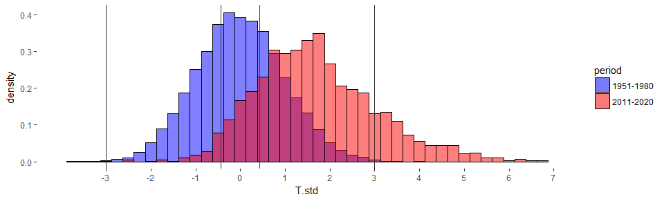
Now, let’s just look at the baseline period and the most recent decade. I’ve added vertical lines for the temperature ranges. Just like in the NYT articles, the most recent decade is shifted right (hotter on average), and the distribution is more spread out. This chart is for the northern hemisphere only (to match the NYT article), but the results look similar for all data.
all.std %>%
  filter(StationID %in% (sites %>% filter(Latitude > 0) %>% .$StationID),
         period == "1951-1980" | period == "2011-2020") %>%
  ggplot() +
  geom_histogram(aes(x = T.std, fill=period, y =..density..),
                 color = "black",
                 alpha=0.5, position="identity", binwidth = 0.25) +
  geom_vline(xintercept = c(-3, -0.43, 0.43, 3), color="grey20") +
  scale_fill_manual(values = c("1951-1980" = "blue", "2011-2020" = "red")) +
  scale_x_continuous(limits = c(-4, 7), breaks = -3:7) +
  theme(panel.background = element_blank())
## Warning: Removed 2 rows containing non-finite values (stat_bin).
#ggsave(filename = "NorthernHemispheres2011-2020.png", units = "in",
#       height = 6, width = 10)
Remember how past +3 LSTM was considered “Extremely Hot” in the period 1950-1980? There were very few summer averages in this range as you can see you in the chart above. The most recent decade has a freakishly large increase in such extremely hot days. They really have become more common. The code below calculates what percent of summer temperatures fall in each temperature bucket. Nowadays, over 15% of summers would have been considered “extremely hot” while our parents were growing up (ok, my parents - I don’t know how old your parents are).
all.std %>%
  filter(StationID %in% (sites %>% filter(Latitude > 0) %>% .$StationID),
         period == "2011-2020") %>%
  select(T.std.bucket) %>%
  count(T.std.bucket) %>%
  mutate(p = percent(n/sum(n))) %>%
  kable()
| T.std.bucket | n | p |
|---|---|---|
| Extremely Cold | 3 | 0.1% |
| Cold | 103 | 3.1% |
| Normal | 467 | 13.9% |
| Hot | 2238 | 66.4% |
| Extremely Hot | 557 | 16.5% |
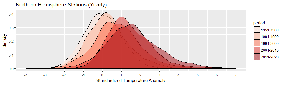
Now that we’ve looked at the most recent decade, let’s take a look at all decades since the baseline period. You can easily see the progression of hotter and hotter summers.
all.std %>%
  filter(StationID %in% (sites %>% filter(Latitude > 0) %>% .$StationID),
         period != "0-1950") %>%
  ggplot() +
  geom_density(aes(T.std, fill=period), color="black", alpha=0.5) +
  scale_x_continuous(name = "Standardized Temperature Anomaly",
                     limits = c(-4,7), breaks=-4:7) +
  scale_fill_brewer(palette = "Reds") +
  ggtitle("Northern Hemisphere Stations (Yearly)")
#ggsave(filename = "NorthernHemispheresYearlyByDecade.png", units = "in",
#       height = 6, width = 10)