Indoor air quality monitoring is becoming a hobby of mine. I find it fascinating that so much of our health could be impacted by something that is completely invisible (in many senses of the word) to us. I recently decided to purchase an Airthings Wave Plus. It monitors CO2, temperature, humidity, air pressure, TVOC (total volatile organic compounds) and radon. So far I haven’t been disappointed! It’s a fantastic sensor, the dashboard allows me to easily pull the data and explore it on my own, and the readings overall make sense.
Overview
This blog post is about the CO2 levels in various parts of my house. The device is battery operated, and it’s easy to move from place to place, so I put in my wife and mine’s bedroom to start, then my office, then my twin girls’ room. I’ll focus on CO2 levels for this post. High levels of CO2 can reduce cognitive ability and lower quality sleep.
Data Ingestion and Cleaning
Getting the data from Airthings was easy. Formatting it and learning how to deal with dates (once again…) was a pain. I’m beginning to get the programmers equivalent of PTSD every time I need to deal with dates. It’s just a giant pain. It’s only slightly comforting to know that it’s because time is actually really confusing and there’s no simple way around that. The best package that I’ve found for dealing with time in R is the lubridate package (part of the Tidyverse - of course - because every good thing in R comes from the Tidyverse). The cheat sheet at the link is invaluable.
The next pain was offsetting the dates so I could get every day to start at the same point on the graph. See the code below for details, but basically there’s a way to offset just the day component of date so that all the days get shifted to the first day of the year, then I had to offset to time backwards so that my plots would start at 4pm and have the night time (when the rooms are occupied) in the middle of the graph. This took me longer than it should have.
vent.status <- read.csv("./data/Home Status.csv", stringsAsFactors = F) %>%
  mutate(date = mdy(date))

iaq.vars <- c("dt","radon","temp","humidity","pressure","co2","voc")
iaq.units <- c("YYYY-MM-DDTHH:MM:SS", "pci.L", "F", "percent", "mbar", "ppm", "ppb")
names(iaq.units) <- iaq.vars

iaq <- read.delim("./data/2020-10-11_airthings_download.csv",
                  sep = ";", col.names = c(iaq.vars)) %>%
  mutate(# Adjust for timezone
         dt = ymd_hms(dt) - 3600*7,
         date = date(dt),
         # Offset time for nice plotting
         day.offset = date(dt-dhours(16)),
         # Put everything at the first day of the year
         dt.offset = update(dt-dhours(16), ydays=1) + dhours(16)) %>%
  left_join(vent.status, by="date") %>%
  # Need to set the evening & morning to the same room status and room location
  group_by(day.offset) %>%
  mutate(rs_raw = room_status,
         room_raw = room,
         room_status = room_status[1],
         room = room[1])
Master Bedroom
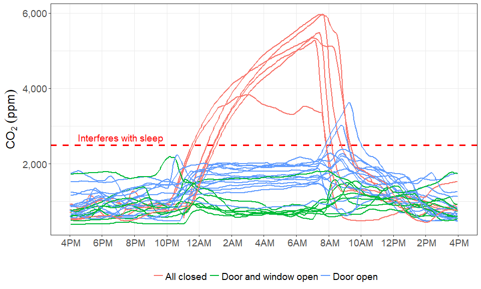
The master bedroom is where I started my exploration. I experimented with keeping the door and windows shut. This is how my wife and I normally go to sleep. It’s quiter and we have some more privacy from the kids (the girls’ room is right next to ours). All these days you can see in red below. Notice how high the CO2 levels go! We hit hearly 6,000 at worst and always over 3,000 at best. Around 2,400 ppm is where research has shown the negative effects to kick in (my guess is the magnitude of the effect is roughly linear with CO2 levels, but the experiment only tested two conditions). One day I plan to put together a more comprehensive literature review, but for now, if you’re interested in a high level overview, check out “Healthy Buildings” by Joseph Allen and John Macomber.
After establishing just how bad my baseline condition was, I decided to try opening windows and my room door, and keeping the windows closed but the door open. The green lines are the ‘full ventilation’ mode and you can see that the CO2 is very low - only a little higher than ambient outdoor levels of ~400 ppm. However, this is not a good option during the winter, and we live on a somewhat busy road and the road noise is a real problem for getting to sleep. The “door open” solution keeps the windows closed. This is not as good as full ventilation, but definitely and improvement over the baseline “all closed” condition.
#tmp <-
iaq %>%
  filter(room == "master", room_status != "Unknown") %>%
  #filter(!(hour(dt.offset) >= 12 & hour(dt.offset) <= 18)) %>%
  ggplot(aes(x=dt.offset, y=co2)) +
  geom_hline(aes(yintercept=2500), size=1.25, linetype=2, color="red") +
  annotate("text", x=ymd_hm("2020-01-01T:16:30"), y=2500,
           label="Interferes with sleep", vjust=-0.5, hjust=0, size=5, color="red") +
  geom_path(aes(group = day.offset, color=room_status), size=0.5) +
  scale_x_datetime(breaks = date_breaks("2 hour"), labels = date_format("%l%p")) +
  theme_bw() +
  scale_y_continuous(label=comma) +
  xlab("") +
  ylab(expression(CO[2]~(ppm))) +
  theme(legend.position="bottom",
        legend.title=element_blank(),
        panel.grid.minor.x = element_blank(),
        text = element_text(size=18))
Girl’s Room
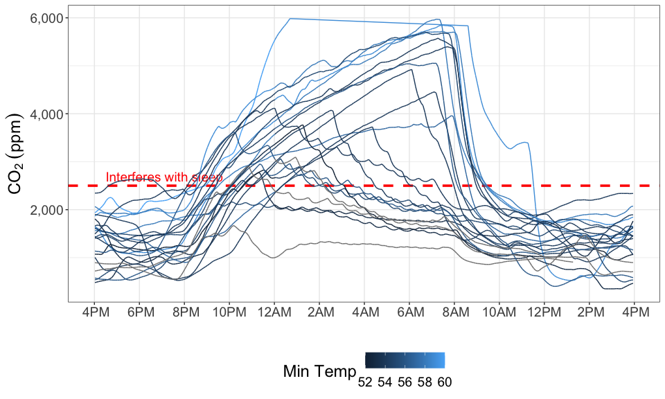
The girl’s room is interesting because it started to get cold in Seattle while the device was in their room. The heater would occasionally turn on during the night, and this likely circulated the air better. I downloaded the minimum daily temperature for SEA-TAC airport from NOAA and color-coded the plot below by it (rather than door status because the doors and windows were always closed in the girl’s room).
The lines that trend down but have “squiggles” on them I believe are when the heater kicks on. However, we didn’t always have the heater turned on at night, so there are some cold nights that don’t show that pattern.
Also interesting, the highest measurement on the chart was actually when the girl’s had one of their cousin’s over for sleep over. I think the CO2 sensor maxes out at 6,000 ppm because it stops there and doesn’t pick up again until the reading drops below 6,000.
weather <- read.csv("./data/weather.csv", stringsAsFactors = F) %>%
  filter(!is.na(TMIN), STATION == "USW00024233") %>%
  select(NAME, date = DATE, TMAX, TMIN, PRCP) %>%
  mutate(date = date(date))

iaq %>%
  filter(room == "Girls Room", room_status != "Unknown") %>%
  left_join(weather, by="date") %>%
  mutate(cold.night = TMIN < 55) %>%
  ggplot(aes(x=dt.offset, y=co2)) +
  geom_hline(aes(yintercept=2500), size=1.25, linetype=2, color="red") +
  annotate("text", x=ymd_hm("2020-01-01T:16:30"), y=2500,
           label="Interferes with sleep", vjust=-0.5, hjust=0, size=5, color="red") +
  geom_path(aes(group = day.offset, color=TMIN), size=0.5) +
  scale_x_datetime(breaks = date_breaks("2 hour"), labels = date_format("%l%p")) +
  theme_bw() +
  scale_y_continuous(label=comma) +
  xlab("") +
  ylab(expression(CO[2]~(ppm))) +
  scale_color_continuous(name="Min Temp") +
  theme(legend.position="bottom",
        panel.grid.minor.x = element_blank(),
        text = element_text(size=18))
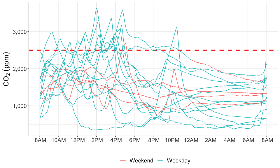
My Office
For my office, the chart below focuses on the middle of the day when I’m working. This is the COVID era, so I’ve been working from home this whole time. High CO2 levels could actually make me slightly dumber while I work, not a good thing of course. I keep the door open and closed randomly throughout the day - mostly closed during phone calls. This leads to multiple spikes in the CO2 level. The line color is set to whether it was a weekday or a weekend, as my patterns in the office are obviously going to be different. I do spent some time in my office on weekends, just not as much.
You can see the days I was working late as the CO2 level spikes.
#tmp <-
iaq %>%
  filter(room == "office", room_status != "Unknown") %>%
  mutate(day.of.week = wday(dt, label = TRUE),
         weekend = factor(day.of.week %in% c('Sat','Sun'), levels=c(T,F),
                          labels=c("Weekend","Weekday")),
         day.offset = date(dt-dhours(8)),
         dt.offset = update(dt-dhours(8), ydays=0) + dhours(8)) %>%
  ggplot(aes(x=dt.offset, y=co2)) +
  geom_hline(aes(yintercept=2500), size=1.25, linetype=2, color="red") +
  geom_path(aes(group = day.offset, color=weekend), size=0.5) +
  scale_x_datetime(breaks = date_breaks("2 hour"), labels = date_format("%l%p")) +
  theme_bw() +
  scale_y_continuous(label=comma) +
  xlab("") +
  ylab(expression(CO[2]~(ppm))) +
  theme(legend.position="bottom",
        legend.title=element_blank(),
        panel.grid.minor.x = element_blank(),
        text = element_text(size=18))