One issue I’ve run into when using R and ggplot is trying to create stacked horizontal bar plots in ggplot that don’t start at zero. In survey analysis these are often the simplest way to convey the results of a matrix-style question with a Likert response scale. There are some good packages out there - the one that gets the closest to what I want is Jason Bryer “likert” package.
However, I found it difficult to make modifications to this package to get just the plot I wanted. The underlying code was too complex for me to make simple changes. So, I finally got around to creating my own version. I’m not going to make it into a package or anything like that. I’m providing it as is so that anyone can hack it easily into whatever they need.
Overview
library(dplyr)
library(ggplot2)
library(knitr)
library(tidyr)
library(scales)
First, some example data. I’ll generate data that looks like common output from a survey. Each row will be a respondent, and the columns will be the answers to questions. Let’s assume that Q1 through Q5 were questions in a ‘matrix style’ group of questions. That means they are five questions that shared a common set of response options. For simplicitly, I’ll use the common “strongly agree to strongly disagree” scale.
# Simulation N responses
N <- 50
answers <- c("Strongly Disagree","Somewhat Disagree","Neither Agree nor Disagree",
              "Somewhat Agree", "Strongly Agree")
set.seed(12342)
d <- tibble(
  id = paste0("Respondent", 1:N),
  Q1 = sample(answers, N, replace=TRUE),
  Q2 = sample(answers, N, replace=TRUE),
  Q3 = sample(answers, N, replace=TRUE),
  Q4 = sample(answers, N, replace=TRUE),
  Q5 = sample(answers, N, replace=TRUE)
)

kable(d[1:10,])
| id | Q1 | Q2 | Q3 | Q4 | Q5 |
|---|---|---|---|---|---|
| Respondent1 | Somewhat Agree | Strongly Disagree | Neither Agree nor Disagree | Somewhat Disagree | Somewhat Agree |
| Respondent2 | Somewhat Agree | Neither Agree nor Disagree | Strongly Disagree | Strongly Agree | Somewhat Agree |
| Respondent3 | Strongly Disagree | Somewhat Agree | Strongly Disagree | Neither Agree nor Disagree | Somewhat Agree |
| Respondent4 | Strongly Disagree | Neither Agree nor Disagree | Strongly Disagree | Neither Agree nor Disagree | Somewhat Disagree |
| Respondent5 | Somewhat Disagree | Strongly Disagree | Somewhat Disagree | Strongly Agree | Somewhat Agree |
| Respondent6 | Somewhat Disagree | Somewhat Disagree | Strongly Disagree | Somewhat Disagree | Somewhat Disagree |
| Respondent7 | Strongly Disagree | Somewhat Disagree | Strongly Agree | Strongly Agree | Strongly Agree |
| Respondent8 | Somewhat Disagree | Somewhat Agree | Strongly Disagree | Neither Agree nor Disagree | Strongly Disagree |
| Respondent9 | Somewhat Disagree | Strongly Disagree | Somewhat Disagree | Neither Agree nor Disagree | Somewhat Agree |
| Respondent10 | Strongly Agree | Neither Agree nor Disagree | Strongly Disagree | Strongly Agree | Strongly Agree |
Now that we have some practice data, let’s reduce it to a form that will make plotting easier. What we want is for each row to be a statement, response, count summary. At this point I’ll also convert the responses into a factor with the levels ordered appropriately. This will be important later on.
d.reduced <- d %>%
  select(-id) %>%
  gather("Q", "ans") %>%
  group_by(Q, ans) %>%
  summarize(n=n()) %>%
  mutate(per = n/sum(n),
         ans = factor(ans, levels=answers)) %>%
  arrange(Q, ans)
Here are the first 10 rows of the reduced data set.
kable(d.reduced[1:10,])
| Q | ans | n | per |
|---|---|---|---|
| Q1 | Strongly Disagree | 12 | 0.24 |
| Q1 | Somewhat Disagree | 11 | 0.22 |
| Q1 | Neither Agree nor Disagree | 8 | 0.16 |
| Q1 | Somewhat Agree | 7 | 0.14 |
| Q1 | Strongly Agree | 12 | 0.24 |
| Q2 | Strongly Disagree | 10 | 0.20 |
| Q2 | Somewhat Disagree | 10 | 0.20 |
| Q2 | Neither Agree nor Disagree | 13 | 0.26 |
| Q2 | Somewhat Agree | 11 | 0.22 |
| Q2 | Strongly Agree | 6 | 0.12 |
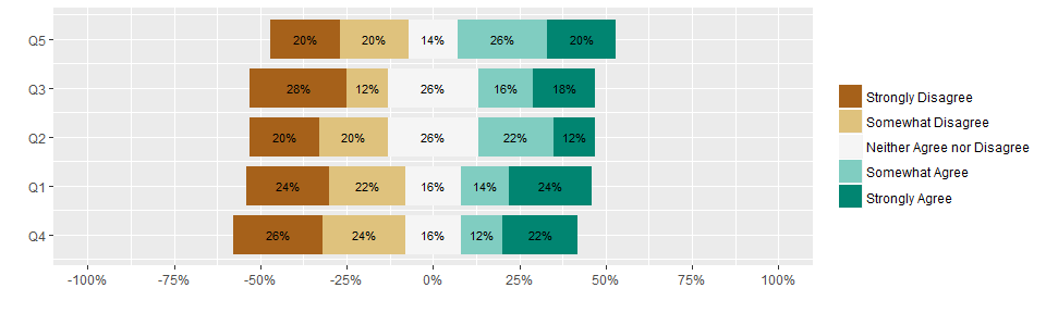
Now comes the actual work of creating a horizontal stacked bar plot. After some experimentation, I decided to forgo trying to use ggplot’s geom_bar function. It required too much hacking to make work appropriately. I found it was much (much) easier to just build the plot using geom_rect. It sounded harder at first, but the calculations are pretty straight forward. It also seamlessly handles odd vs. even numbers of factor levels. When you have an odd number of levels, convention is to take the middle level and center its box at zero. When you have an even number of levels then the two middle levels are placed on either side of zero. I’ll show examples of both
#tmp <-
stage1 <- d.reduced %>%
  mutate(text = paste0(formatC(100 * per, format="f", digits=0), "%"),
         cs = cumsum(per),
         offset = sum(per[1:(floor(n()/2))]) + (n() %% 2)*0.5*(per[ceiling(n()/2)]),
         xmax = -offset + cs,
         xmin = xmax-per) %>%
  ungroup()
The confusing line above is where offset is defined. Basically, each stacked bar is going to have a total length of 1. We need to figure out how much to offset each bar such that the ‘Likert center’ (either the midpoint of the middle level when there is an odd number of levels or between the middle two when there is an even number of levels) lines up at x=0. The floor(n()/2) component sums half the levels (rounded down), and the n() %%2 component accounts for the half level in case there is an odd number of levels (in an even-numbered level situation, this term goes to zero).
The next step (stage2 I’m calling it) is to arrange the questions by how ‘positive’ they are overall. It is common to arrange the items with the question that had the highest percent of positive responses at the top. This makes it very easy to see which questions got the most positive responses just by looking at the question order in the plot. To do that, we just need to figure out which question had the most positive xmax value, then set the questions y-values accordingly.
gap <- 0.2

stage2 <- stage1 %>%
  left_join(stage1 %>%
              group_by(Q) %>%
              summarize(max.xmax = max(xmax)) %>%
              mutate(r = row_number(max.xmax)),
            by = "Q") %>%
  arrange(desc(r)) %>%
  mutate(ymin = r - (1-gap)/2,
         ymax = r + (1-gap)/2)
Now we have everything in place to plot it.
ggplot(stage2) +
  geom_rect(aes(xmin = xmin, xmax = xmax, ymin = ymin, ymax = ymax, fill=ans)) +
  geom_text(aes(x=(xmin+xmax)/2, y=(ymin+ymax)/2, label=text), size = 3) +
  scale_x_continuous("", labels=percent, breaks=seq(-1, 1, len=9), limits=c(-1, 1)) +
  scale_y_continuous("", breaks = 1:n_distinct(stage2$Q),
                     labels=rev(stage2 %>% distinct(Q) %>% .$Q)) +
  scale_fill_brewer("", palette = "BrBG")
Now let’s test if it still works with an even number of levels. I’ll do this by removing the middle option and then renormalzing the data
d.r1 <- d.reduced %>%
  filter(ans != "Neither Agree nor Disagree") %>%
  mutate(per = n/sum(n),
         ans = droplevels(ans))

kable(d.r1[1:10,])
| Q | ans | n | per |
|---|---|---|---|
| Q1 | Strongly Disagree | 12 | 0.2857143 |
| Q1 | Somewhat Disagree | 11 | 0.2619048 |
| Q1 | Somewhat Agree | 7 | 0.1666667 |
| Q1 | Strongly Agree | 12 | 0.2857143 |
| Q2 | Strongly Disagree | 10 | 0.2702703 |
| Q2 | Somewhat Disagree | 10 | 0.2702703 |
| Q2 | Somewhat Agree | 11 | 0.2972973 |
| Q2 | Strongly Agree | 6 | 0.1621622 |
| Q3 | Strongly Disagree | 14 | 0.3783784 |
| Q3 | Somewhat Disagree | 6 | 0.1621622 |
Now let’s see if the above code still works (sorry for copy-paste breakage of the ‘do not repeat yourself’ rule, but I figured making a function earlier would detract from explaining how it works)
stage1 <- d.r1 %>%
  mutate(text = paste0(formatC(100 * per, format="f", digits=0), "%"),
         cs = cumsum(per),
         offset = sum(per[1:(floor(n()/2))]) + (n() %% 2)*0.5*(per[ceiling(n()/2)]),
         xmax = -offset + cs,
         xmin = xmax-per) %>%
  ungroup()

stage2 <- stage1 %>%
  left_join(stage1 %>%
              group_by(Q) %>%
              summarize(max.xmax = max(xmax)) %>%
              mutate(r = row_number(max.xmax)),
            by = "Q") %>%
  arrange(desc(r)) %>%
  mutate(ymin = r - (1-gap)/2,
         ymax = r + (1-gap)/2)

ggplot(stage2) +
  geom_rect(aes(xmin = xmin, xmax = xmax, ymin = ymin, ymax = ymax, fill=ans)) +
  geom_text(aes(x=(xmin+xmax)/2, y=(ymin+ymax)/2, label=text), size = 3) +
  scale_x_continuous("", labels=percent, breaks=seq(-1, 1, len=9), limits=c(-1, 1)) +
  scale_y_continuous("", breaks = 1:n_distinct(stage2$Q),
                     labels=rev(stage2 %>% distinct(Q) %>% .$Q)) +
  scale_fill_brewer("", palette = "BrBG")
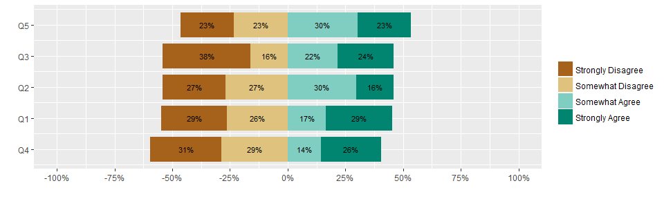
Ta-da! It works for an even number of levels as well without any special if-then cases.
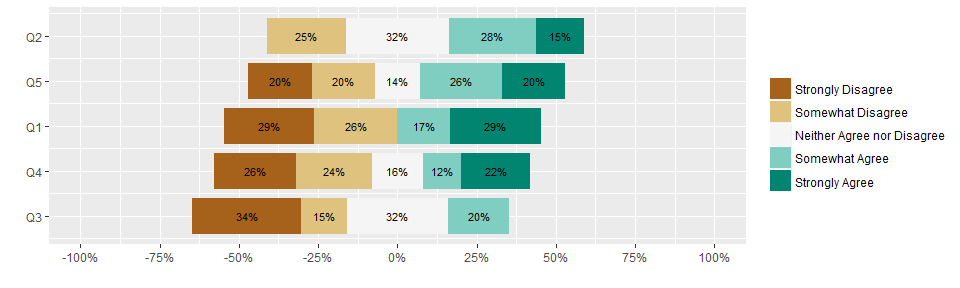
But wait, there is an important edge case to consider. What if a response option was never chosen? In that case, the above code generates the wrong chart as it puts the wrong factor level in the middle of the plot. The trick to overcoming this is to start out by generating an empty dataset that has all combinations of questions and responses, then joining this to the real data. This ensures that any absent levels are present in the data, but with a value of zero. The math all works the same and the correct level will end up in the middle of the plot.
To test this, I’ll remove a couple rows from the original d.reduced data frame, then renormalize as before
d.r2 <- d.reduced[c(1:2, 4:5, 7:14, 16:25),]
d.r2 <- d.r2 %>%
  mutate(per = n/sum(n))

kable(d.r2[1:10,])
| Q | ans | n | per |
|---|---|---|---|
| Q1 | Strongly Disagree | 12 | 0.2857143 |
| Q1 | Somewhat Disagree | 11 | 0.2619048 |
| Q1 | Somewhat Agree | 7 | 0.1666667 |
| Q1 | Strongly Agree | 12 | 0.2857143 |
| Q2 | Somewhat Disagree | 10 | 0.2500000 |
| Q2 | Neither Agree nor Disagree | 13 | 0.3250000 |
| Q2 | Somewhat Agree | 11 | 0.2750000 |
| Q2 | Strongly Agree | 6 | 0.1500000 |
| Q3 | Strongly Disagree | 14 | 0.3414634 |
| Q3 | Somewhat Disagree | 6 | 0.1463415 |
Here’s the final code to generate a horizontal stacked bar plot.
# Create the full combination of questions and response options
full.set <- expand.grid(unique(d.r2$Q), answers, stringsAsFactors=F) %>%
  mutate(Var2 = factor(Var2, answers))
names(full.set) <- names(d.r2)[1:2]

stage1 <- d.r2 %>%
  # Do the full join to keep levels that aren't in the original data
  full_join(full.set, by=names(full.set)) %>%
  # Need to reorder before calculating offsets
  arrange(Q, ans) %>%
  # NA's are missing levels, replace with zero
  mutate(n = replace_na(n, 0),
         per = replace_na(per, 0),
         # Hide the text label if level is missing
         text = if_else(n >0, paste0(formatC(100 * per, format="f", digits=0), "%"), ""),
         cs = cumsum(per),
         offset = sum(per[1:(floor(n()/2))]) + (n() %% 2)*0.5*(per[ceiling(n()/2)]),
         xmax = -offset + cs,
         xmin = xmax-per) %>%
  ungroup()

stage2 <- stage1 %>%
  left_join(stage1 %>%
              group_by(Q) %>%
              summarize(max.xmax = max(xmax)) %>%
              mutate(r = row_number(max.xmax)),
            by = "Q") %>%
  arrange(desc(r)) %>%
  mutate(ymin = r - (1-gap)/2,
         ymax = r + (1-gap)/2)

ggplot(stage2) +
  geom_rect(aes(xmin = xmin, xmax = xmax, ymin = ymin, ymax = ymax, fill=ans)) +
  geom_text(aes(x=(xmin+xmax)/2, y=(ymin+ymax)/2, label=text), size = 3) +
  scale_x_continuous("", labels=percent, breaks=seq(-1, 1, len=9), limits=c(-1, 1)) +
  scale_y_continuous("", breaks = 1:n_distinct(stage2$Q),
                     labels=rev(stage2 %>% distinct(Q) %>% .$Q)) +
  scale_fill_brewer("", palette = "BrBG")
The chart is easy to customize, and the implementation can easily be made into a function. Happy plotting.