-
Indoor Air CO2 Levels
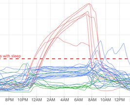 Indoor air quality monitoring is becoming a hobby of mine. I find it fascinating that so much of our health could be impacted by something that is completely invisible (in many senses of the word) to us. I recently decided to purchase an Airthings Wave Plus. It monitors CO2, temperature, humidity, air pressure, TVOC (total volatile organic compounds) and radon. So far I haven’t been disappointed! It’s a fantastic sensor, the dashboard allows me to easily pull the data and explore it on my own, and the readings overall make sense.
-
Global temperature histograms
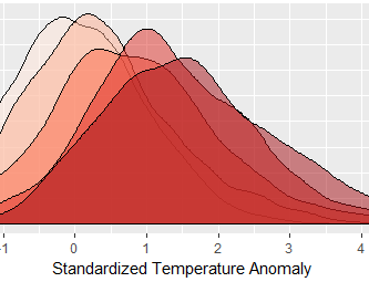 I recently got interested in the work of James Hansen. Some of his work appeared in the New York Times in 2017 as an interesting visualization of climate change. I decided it would be fun to recreate the chart using publicly accessible data.
-
Stacked Likert Plots using ggplot
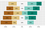 One issue I’ve run into when using R and ggplot is trying to create stacked horizontal bar plots in ggplot that don’t start at zero. In survey analysis these are often the simplest way to convey the results of a matrix-style question with a Likert response scale. There are some good packages out there - the one that gets the closest to what I want is Jason Bryer “likert” package.
-
AR Board Game Proof of Concept
 This post is about a proof-of-concept augmented reality (AR) board game I built. It’s really rough, and not even really a game, but it demonstrates how to use AR markers to manipulate digital artifacts in a way that could form the basis of a multiplayer game. But before getting into that, some back story (if you want to see the video of the app in action, start scrolling).
-
Augmented Reality Research
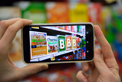 I remember reading a scifi short story once (Analog I believe, but I’ve searched and can’t find the original story) about an implant that would help people make decisions. In the story, a guy goes to the grocery store to buy a bag of rice, and the implant overlays information about the dozens of options available to him. It puts red x’s over the bags that don’t meet one of his criteria, one after another, then when it get’s down to the last couple bags he chooses one made by a company that supports a cause he cares about.
-
A Data Transparency Framework for Mobile Apps
 This is a paper that I drafted in my spare time that relates to the work I’ve done with mobile technology and law enforcement. I got to thinking that the method we were using to track information about the various stakeholders and how data are collected and shared could have wider applicability. I’ve submitted this to a journal, but until I hear back I will leave it here as a post.
-
Derivatives in Apache Math Commons Post Version 3.0
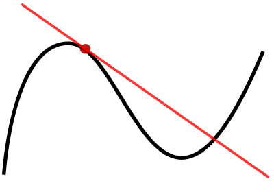 For my dissertation, I’ve been using the Apache Math Commons Java library in order to incorporate some numerical analysis into an agent based economic model I’ve built. I started out using version 3.0 of the library and defining a function that had a derivative was pretty straight forward.
-
Visualization of U.S. Electricity Generation via the EPA's eGRID Dataset
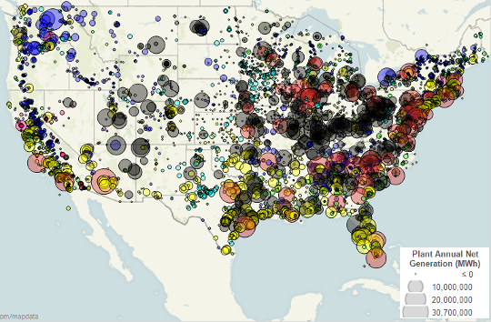 Here is my attempt to show how power is generated in the United States. The data comes from the EPA’s eGRID data set, with 2009 being the most recent data. It is a geographic bubble chart with the amount of energy produced at each plant represented by its size, and the fuel source for that energy by the bubble’s color. I’ve used some transparency to help with the overplotting. Even so, many points close together are hard to distinguish. I added a dark border to each bubble to help with that.
 Indoor air quality monitoring is becoming a hobby of mine. I find it fascinating that so much of our health could be impacted by something that is completely invisible (in many senses of the word) to us. I recently decided to purchase an Airthings Wave Plus. It monitors CO2, temperature, humidity, air pressure, TVOC (total volatile organic compounds) and radon. So far I haven’t been disappointed! It’s a fantastic sensor, the dashboard allows me to easily pull the data and explore it on my own, and the readings overall make sense.
 I recently got interested in the work of James Hansen. Some of his work appeared in the New York Times in 2017 as an interesting visualization of climate change. I decided it would be fun to recreate the chart using publicly accessible data.
 One issue I’ve run into when using R and ggplot is trying to create stacked horizontal bar plots in ggplot that don’t start at zero. In survey analysis these are often the simplest way to convey the results of a matrix-style question with a Likert response scale. There are some good packages out there - the one that gets the closest to what I want is Jason Bryer “likert” package.
 This post is about a proof-of-concept augmented reality (AR) board game I built. It’s really rough, and not even really a game, but it demonstrates how to use AR markers to manipulate digital artifacts in a way that could form the basis of a multiplayer game. But before getting into that, some back story (if you want to see the video of the app in action, start scrolling).
 I remember reading a scifi short story once (Analog I believe, but I’ve searched and can’t find the original story) about an implant that would help people make decisions. In the story, a guy goes to the grocery store to buy a bag of rice, and the implant overlays information about the dozens of options available to him. It puts red x’s over the bags that don’t meet one of his criteria, one after another, then when it get’s down to the last couple bags he chooses one made by a company that supports a cause he cares about.
 This is a paper that I drafted in my spare time that relates to the work I’ve done with mobile technology and law enforcement. I got to thinking that the method we were using to track information about the various stakeholders and how data are collected and shared could have wider applicability. I’ve submitted this to a journal, but until I hear back I will leave it here as a post.
 For my dissertation, I’ve been using the Apache Math Commons Java library in order to incorporate some numerical analysis into an agent based economic model I’ve built. I started out using version 3.0 of the library and defining a function that had a derivative was pretty straight forward.
 Here is my attempt to show how power is generated in the United States. The data comes from the EPA’s eGRID data set, with 2009 being the most recent data. It is a geographic bubble chart with the amount of energy produced at each plant represented by its size, and the fuel source for that energy by the bubble’s color. I’ve used some transparency to help with the overplotting. Even so, many points close together are hard to distinguish. I added a dark border to each bubble to help with that.
